Beginners Guide to better use cohort analytics in Google Analytics
Cohort analysis is a particularly useful feature for marketers and small businesses. It can tell you how your website is performing as a whole, making it a powerful tool for understanding the customer lifetime value and the long-term health of your business.
What is a cohort? In a nutshell, a cohort is simply a subset of users grouped by shared characteristics.
Cohort analysis is a customer behavior analysis technique that can analyze the long-term behavior of a subset (or segment) of a customer group. Using "cohort analysis" allows you to compare the behavior and metrics of different cohorts over time. Then you can find the best (or lowest) cohort and what factors are driving this effect.
This tutorial will briefly introduce field parameters and their usage in Google Analytics reports, introduce how to use cohort analysis better, and some tips with cases.
Let’s get started.
First, enter the google analytics report. You can find the Cohort Analysis report under Audience.
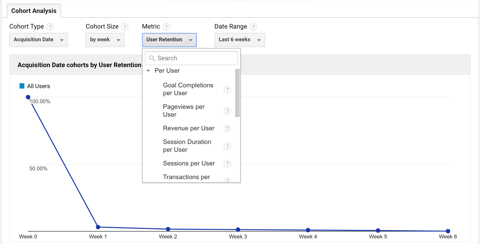
At the top of the cohort analysis report, you can adjust settings for cohort type, cohort size, metric, and date range.
Cohort type: currently, the only option is acquisition date (the date of the user’s first session)
Cohort size: you can choose to define cohorts by day, by week, or by month. For instance, if you select by month, then each cohort represents the users acquired in a particular month (e.g. the January cohort includes all the users who had their first session in January)
Date range: the window of time that you want to examine (e.g. the last 6 weeks)
The range you choose depends on the scope of data you want to analyze, as well as the size of your cohort. One week may provide plenty of data if your cohorts are broken down by day, but you’ll need to select a larger date range for any larger cohorts.
Metric: the data you’ll see in the report. The default metric is user retention, which measures the percent of users that return.
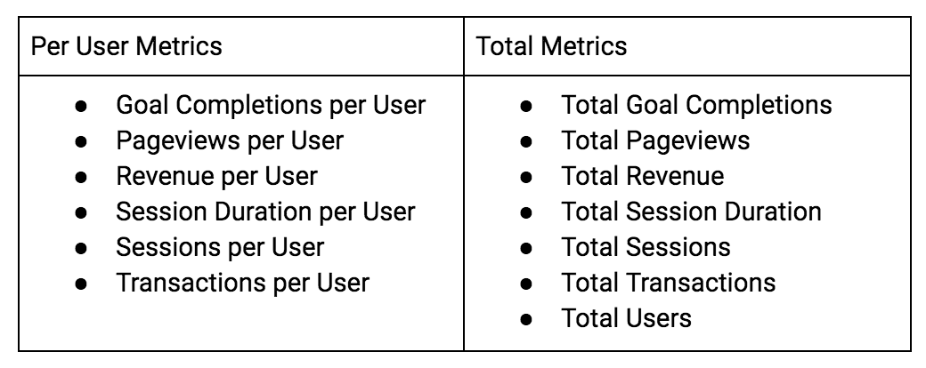
You can also choose these “per user” metrics and “total” metrics:
You can then select which cohorts to display on the graph.
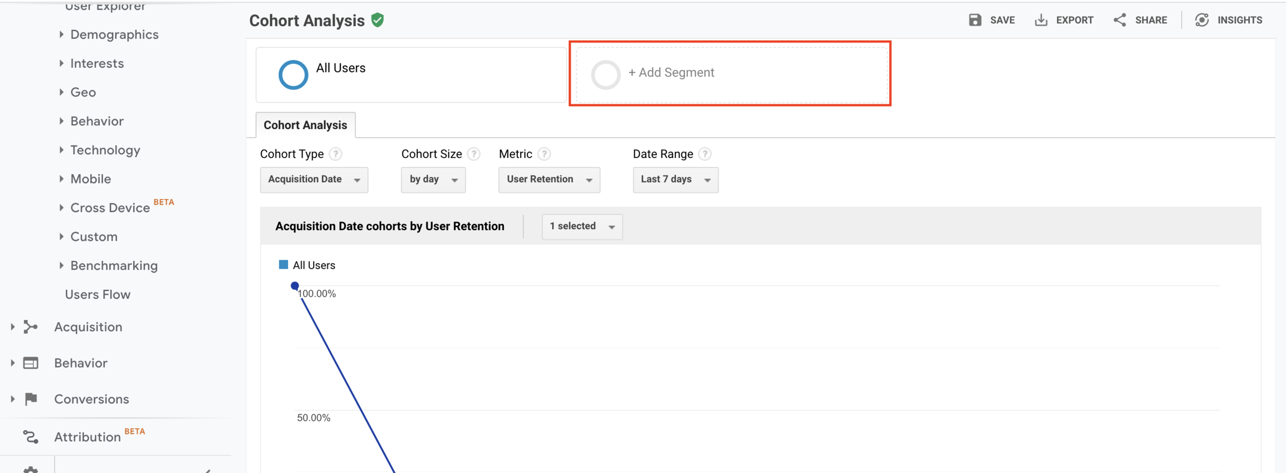
Second, you can also add additional segments (e.g. mobile/tablet traffic, etc) for comparison, just like with any other report, by clicking the plus button next to “All Users” at the top of the report. You can add segments you want and compare them.
Analyzing specific segments, instead of your audience as a whole, will give you a clearer idea of what makes a great customer for your business and can help you learn more about what influences specific behaviors and the impact your marketing campaigns and strategies have.
However, the real meat of the cohort analysis report is the heat map right below this graph. For example, below I compare All Users with the Paid Traffic segment.
The meat of the cohort analysis report in Google Analytics:
This heat map allows you to quickly identify the highest (and lowest) performing metrics by cohort and week after the acquisition date.
Week 0 represents the week in which that cohort’s users had their first session. This cohort heat map cannot be exported, so you may have to copy/paste or screenshot the graphic.
Let’s say that I ran a new Adwords remarketing campaign the week of 9/11 to retarget users who visited my site. As you can see in the Cohort Analysis report above, my user retention went up significantly that week.
This may be evidence that my remarketing campaign increases user retention, which I can further explore in my Adwords report (under Acquisition).
This is why I recommend pulling up your marketing calendar in a separate window to overlay your cohort heat map with the context of your marketing activities.
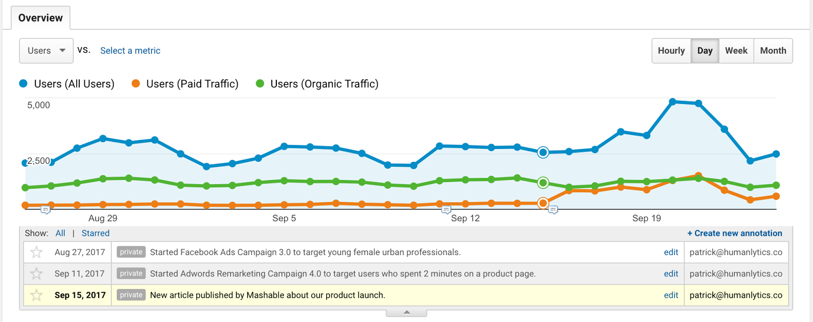
If you just want to track the dates of your marketing campaigns, I suggest trying the built-in Annotations feature in Google Analytics reports.
Annotations are marking what day I started my digital marketing campaigns to add context to my Google Analytics report metrics.
Annotations allow you to write notes for certain days in your Google Analytics reports, which can be helpful for marking when new marketing activities or campaigns begin and end. To access annotations, simply click on the down arrow tab at the bottom of the graph for a report.
If you’re looking for a more sophisticated marketing calendar platform, I suggest looking into collaborative tools such as “CoSchedule”.
Either way, looking at your Cohort Analysis report and your marketing calendar (or Google Analytics annotations) side-by-side is especially useful if you organize your marketing activities by days, weeks, or months.
For example, perhaps your content marketing team publishes new blog posts every Monday. You can see if your Monday cohorts have higher user retention (perhaps they become more engaged, sign up for a newsletter, and return to the site more often).
Or perhaps your team decides to test a different target audience or buyer persona each month for three months. You can see the differences in user retention by month in the Cohort Analysis report to see which audience is most engaged with your content or ads. You can run these kinds of experiments to test different marketing channels, campaigns, website designs, new product offerings, and promotions.
Warning: Beware of weekends when you’re doing cohort analysis by day. Many businesses will see a dip in metrics like retention on weekends compared to weekdays.
As you can see, you see a slight dip in retention for the 9/22 cohort for the Google Merchandise Store. This may be because 9/22 is a Friday, and Day 1 (which has a lower retention rate of 2.74%) is a Saturday.
To drill down on any cohort of interest, you can turn the cohort into a custom segment to further investigate what drives a high-performing or high-traction cohort. Although combining segmentation analysis and cohort analysis is more advanced and requires more time to uncover insights, this is where you can really dig deeper into which factors are really driving revenue for your business over time.
Here are some example use cases of cohort analysis:
Use Annotations: Start using Google Analytics Annotations or a marketing calendar to track your marketing activities and campaigns. This will help you see the impact of your marketing initiatives in Google Analytics reports, including the Cohort Analysis report.
Test Your Marketing Activities: Start running experiments to test audiences, channels, and website design by a week or by month (eg test one marketing channel per month). Schedule a half-hour one day every week to look at your Cohort Analysis report to check the results of these tests.
Drill Down on Unusual Cohorts: If you see significant increases or decreases in metrics like user retention for a certain cohort, check your marketing calendar to identify what changes could be driving these movements in your metrics. Turn these cohorts of interest into custom segments to dig deeper into their behavior.
In short, cohort analysis is a very useful tool. Use Google Analytics Annotations or Marketing Calendar to track campaigns or ads, test your campaigns and discover which behaviors or factors drive these metrics based on the test results, continually improve User Retention, and boost business profitability.
If you have any questions feel free to leave comments and we'll be happy to answer them.


